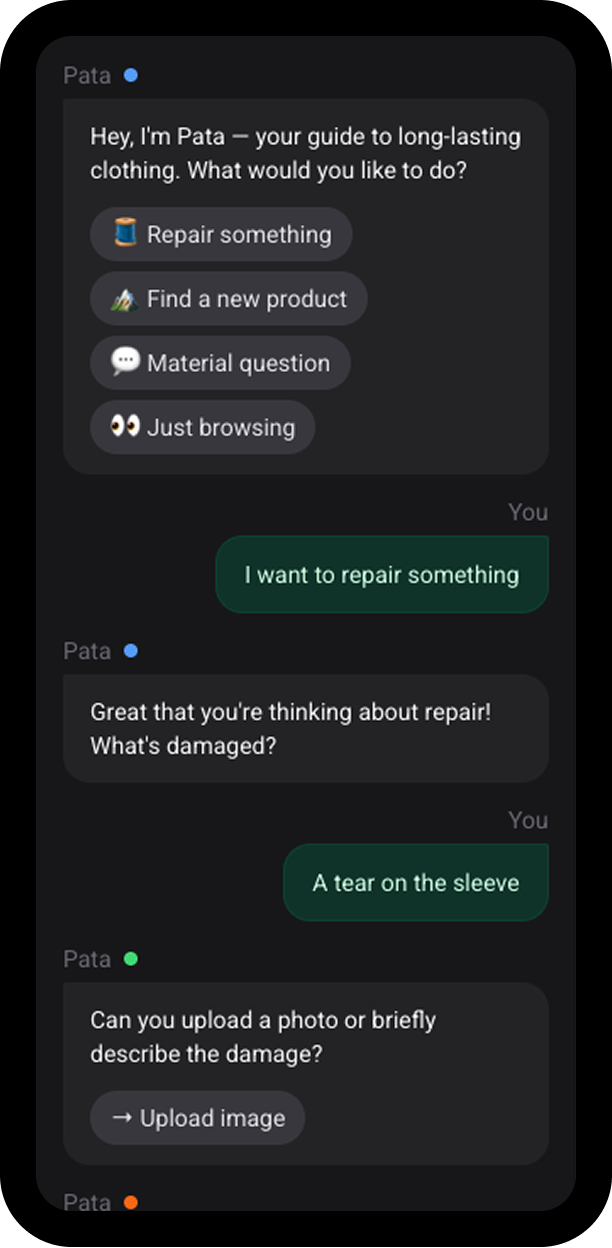
Patagonia's AI Agent
Conversational B2C interface shaped by the brand's personality and values.
Designing a comprehensive design system for UpSkill that bridges design and development workflows, enabling consistent user experiences across mobile, tablet, and desktop.
Senior Product Designer
Multi-theme design system
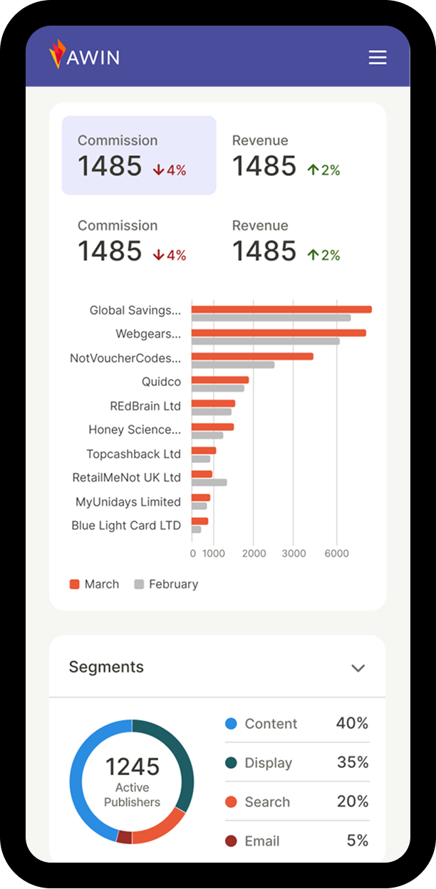
UpSkill's learning platform required a cohesive design system adaptable for different devices. Without foundational standards, the project faced three key challenges: establishing responsive typography and spacing systems, creating a scalable token structure, and balancing flexibility with constraint to support diverse content within a unified visual language.
I began by reviewing user stories and acceptance criteria for the home page, user dashboard, and course details page. To contextualize these requirements, I conducted a competitive audit of learning platforms to understand content structure, user flow, and visual hierarchy. These insights shaped the initial responsive wireframes across mobile, tablet, and desktop, helping define the necessary components and interaction patterns.
With a solid functional foundation, I developed a modular component framework built from reusable elements such as navigation, course cards, and progress trackers, validating their behavior across breakpoints. I then explored theming to define the platform's visual direction—applying the 60/30/10 rule and testing color, typography, and component styling. This led to the creation of foundational design tokens, including a responsive type scale, a 12-tints color palette, and core UI elements, ensuring consistency, scalability, and a cohesive brand experience.
To establish a scalable and intuitive naming system, I explored multiple token structure models, including more complex taxonomies with role-based layers. After testing different outputs across use cases —such as container layering and CTA differentiation— I adopted a streamlined structure:
category | property | variant | state
color-text-default) for quick access, while nesting specific cases
deeper (e.g., color-text-feedback-error)To simplify typography while keeping it adaptable, I built the system on a single primitive type scale — 11 fixed sizes from 12px to 32px in 2-pixel increments, aligned to the 16px/8px grid. This scale acts as the source of truth, and all responsive behavior is handled through token aliasing, not separate scales.
For each breakpoint, I applied tailored modular ratios — Minor Third on mobile, Major Third on tablet, and Perfect Fourth on desktop—to adjust typographic contrast. These ratios remap the primitives to create a distinct, responsive hierarchy using only eight surface-level type roles: two body sizes, four title sizes, and two display sizes.
This approach provides a streamlined, easy-to-use system for designers and developers while maintaining flexibility across dense dashboards, content-heavy pages, and expressive hero sections.
Following the same logic as the typographic scale, I created a set of primitive
spacing tokens aligned to the 8px grid and named using fractions of the 16px base
(1rem). This keeps the scale both semantically meaningful and future-proof. For
example, 100 = 1rem = 16px and 050 = 0.25rem = 4px.
I then expanded these primitives into a semantic spacing system with clear, purpose-driven categories: inline for horizontal gaps, stack for vertical spacing, and inset for internal padding, along with contextual tokens such as margin and gutter. This separation between primitives and semantics makes layouts more scalable with greater control and flexibility.
I built a component library in Figma with full light/dark theme support, organized through three variable collections: Primitives, Device, and Theme. This structure enables automatic responsive and thematic behavior without manual token swapping. The library includes foundational elements and layout templates, supported by concise documentation that streamlines designer-developer handoff and empowers both teams to work autonomously while maintaining system integrity.
This system established a scalable foundation for UpSkill's platform, ensuring a seamless experience across all devices. By architecting a semantic token system, I enabled native support for multi-theme rendering—including dark mode and device adaptable spacing. The resulting modular library empowers teams to ship faster while maintaining WCAG compliance and visual consistency across every environment.