


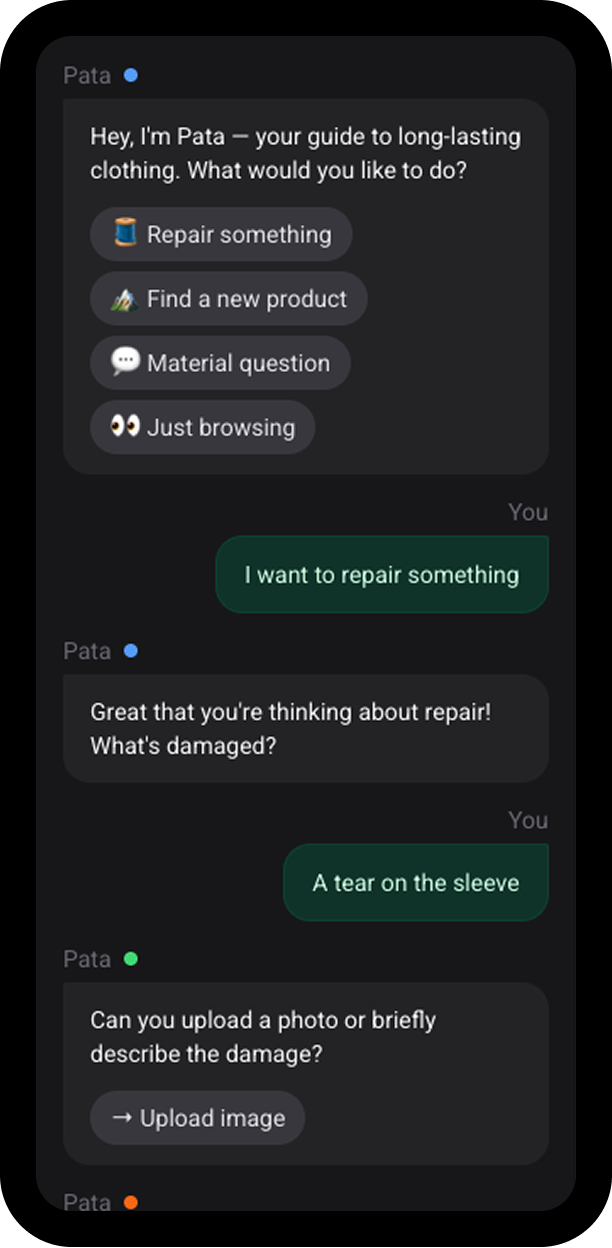
Patagonia's AI Agent
Conversational B2C interface shaped by the brand's personality and values.
Building a scalable, token-based design system for a global B2B SaaS platform, aligning design and engineering while supporting complex, data-heavy interfaces.
Senior UX/UI Designer (IC)
New scalable foundation
Awin's growth from 2 to 10+ dev teams triggered a UI breaking point. Without a unified system, squads operated in silos. Design patterns were "repeated" rather than "reused". Teams were constantly recreating components from scratch.
The platform hosted five different date-pickers, each with accessibility gaps. Maintenance became a "consistency tax": rebranding required manual fixes across hundreds of instances instead of a simple token swap.
On top of that, Awin runs as a white-label platform: the same components had to render under multiple white label brands.
I began with a comprehensive audit of key dashboards and reports, cross-referencing behavioral analytics (Amplitude and Hotjar) with heuristic evaluations and Lighthouse audits. This data-driven approach moved the conversation beyond visual critique, allowing us to pinpoint high-impact usability gaps and user friction where it mattered most in real-world usage.
To define scope, I mapped the platform via a component-to-page matrix and scored each page in a prioritization matrix across component coverage, build complexity, technical independence, and usage. This informed a phased rollout that prioritised proof-of-concept speed over visual impact.
We chose the Link Builder as the first live pilot. It served the largest user segment (publishers) and was built almost entirely from form primitives (inputs, buttons, selects), the highest-coverage components. A simple page first let us prove the architecture before applying it to data-dense surfaces. See the rollout trade-off
Starting with a low-risk pilot meant the most marketable pages, Dashboard and Reporting, wouldn't show systemised UI for months. To keep stakeholders aligned in the meantime, I built high-fidelity prototypes of both. These functioned as a future-state artifact, making the design system vision tangible and showing a direction rather than just a first step.
Components were standardised in Figma but not tokenised at source. I chose a three-layer token architecture: primitives hold raw values like colour hex codes and pixel measurements, semantic tokens express intent across the system, and brand tokens provide per-brand or per-component overrides on top of the semantic layer. Components render under multiple brand identities by swapping only the brand layer. See token layers
                                                Primitives :
                                                color, typography, spacing, radius
                                                Semantic : [
                                                type | variant | modifier ]
                                                Brand :
                                                awin, white-label-1, white-label-2
On top: atomic component hierarchy, WCAG AA contrast with data-viz palettes, an 8pt spacing system with density variants, and Inter typography for legibility in dense tables.
I introduced a hybrid contribution model: a small stewardship team owned foundations and tokens; product squads contributed components back. New components had to meet three criteria before they were built:
New-built components then entered a review or "incubation" period before adding them to the core library. This included real-use evaluation in product contexts, API fit and UX intent assessment. Additionally a final quality gate (a11y tests, token lint, and visual diff) before merge. Unmet criteria didn't mean rejection but a documented local path.
A token-based design system for a multi-brand, data-heavy platform, with adoption rituals across 10+ squads. Accessibility, theming, and density live at the foundation layer.
See documentation examples: Typography | Color | Input
The system shifted Awin from a component-by-component maintenance model to a centralised design API, where brand logic lives in tokens rather than in code. Rebrands and white-label rollouts that used to require manual updates across hundreds of instances now happen through a single theme layer. Open-source typography removed licensing overhead, and prioritising functional legibility helped reduce user error in dense data environments. Design and engineering now share one vocabulary, which lowered the cost of every cross-functional handoff.