Awin Design System
Scalable, accessible design language for a global B2B SaaS platform.
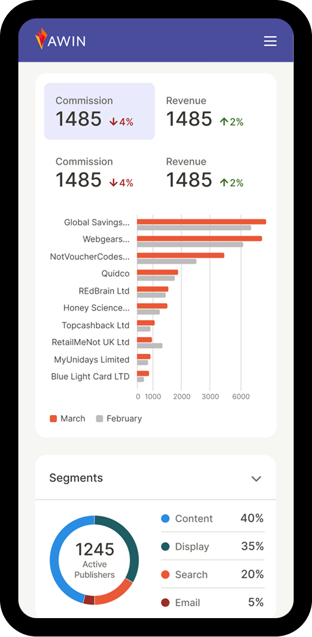
Creating a unified Data Visualization Guide to ensure clarity, consistency, and accessibility across cross-functional teams.
Product Designer
Unified cross-team data viz standard
Teams struggled to create accessible and consistent visualizations. WCAG guidelines—while essential—were often too technical and hard to apply, leading to uneven accessibility practices. Misunderstandings around color usage created tension between brand, clarity, and accessibility.
Teams also lacked a shared approach to chart selection, resulting in inconsistent patterns and duplicated effort.
Stakeholder mapping (influence × relevance) narrowed four groups to three: Product Designer, Front-End Developer, Data Analyst. A cross-functional survey uncovered how each role uses data visualizations and what matters most to them — from color and hierarchy to implementation and labeling clarity.
This reframed the guide from "what we know" to "what each role needs to build accessible data viz." Personas became design constraints, shaping a dedicated section per role: color recipes for designers, scalable code patterns and ARIA roles for engineers, and clearer labeling for analysts.
A closed card sort across roles revealed that content naturally clustered into four groups — and that roles converged on foundations but diverged on application. Designers gravitated to color systems, developers to implementation patterns, analysts moved between concepts and applied charts. This drove a four-pillar structure — Basics & Glossary, Color Palettes, Data Visualizations, and Accessibility — where shared foundations sit upfront and role-specific depth lives downstream.
Screen reader testing using Silktide Simulator revealed keyboard navigation breakdowns. A skip link, placed as the first focusable element, allows users to bypass the main navigation. The accordion component was refactored so each trigger announces its label and state via aria-expanded, while an Escape handler prevents keyboard traps within nested panels.
Semantic structure using landmark roles and properly nested headings reinforce contextual navigation. Interactive elements were adjusted so state changes are consistently announced, reducing ambiguity and cognitive load.
Color contrast and text readability was validated through a systematic audit to ensure WCAG AA compliance across text and UI elements. An optional high-contrast toggle elevates key components to AAA standards and enhances legibility by increasing spacing to recommended values — letter-spacing: 0.12em, word-spacing: 0.16em and line-height: 1.7 — improving readability without altering the core visual system.
Before publication, the guide went through multiple internal review rounds. Cross-functional teams tested the content in their actual workflows, helping identify areas where instructions or examples needed simplification — ensuring the guide was as usable for a data analyst as it was for a front-end developer.
The guide outlined concrete principles for accessible data visualization:
Each discipline benefited in tangible ways:
Designers gained color recipes and usage guidelines; developers received ready-to-use code snippets; analysts learned clearer labeling and annotation techniques. Together, they established a workflow that naturally produced accessible, consistent visualizations.
See homepage prototype in action.
The Data Visualization Guide became a single source of truth for how the organization approaches data visuals. It improved cross-team communication, reduced redundant work, and set clear accessibility expectations from the start of every project.
Early feedback was highly positive. Designers reported faster alignment on color and typography, while developers appreciated having codified accessibility examples instead of scattered references.
This project reaffirmed that accessibility and consistency are inseparable. When teams share a common design language, collaboration becomes smoother — and users benefit from clearer, more inclusive visual communication.
By bringing designers, developers, and analysts together under one accessible framework, we built a foundation for data visualizations that are both unified in appearance and equitable in experience.